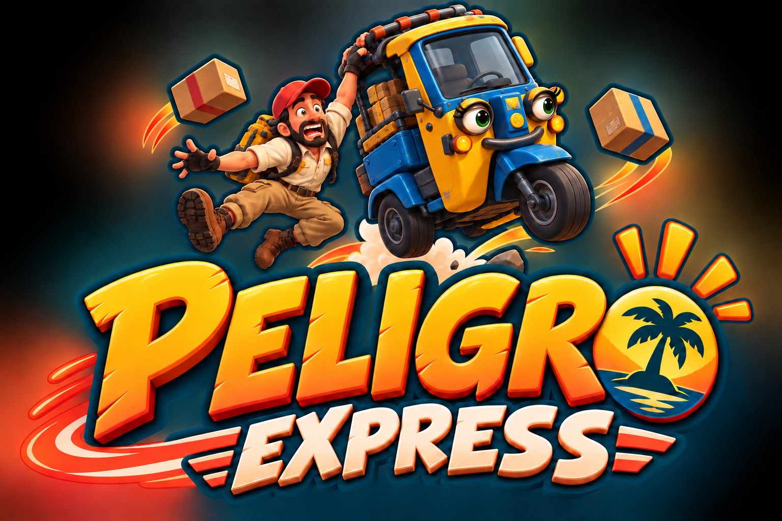
The first logo was far too well behaved.
Rusty and Bonita are the reason I'm making this, so leaving them out of the mark felt strange. I wanted the image to tell you what sort of journey you're in for before I had to explain anything.
Now Rusty is hanging on, Bonita is airborne and the parcels have their own opinions about the landing. That feels much closer to Peligro Express.
A bit of the island in the lettering
I took the colours from the island designs: deep green, hot orange, warm cream and bits of bright water blue. The lettering has enough weight to work alone, but the full version needs those two idiots in it.
This is identity artwork, not a frame from the game. Their models will keep changing. The relationship and the tone, though, finally feel right.
Bleak